

A customer complains on Twitter. Calls your helpline the next day. Leaves a one-star Google review the week after. Each time, they repeat their problem from scratch.
No one on your team connects the dots. Not because they don’t care – because no one has a complete picture of what that customer’s experience actually looks like end to end.
That’s the problem customer experience mapping solves. A CX map is a structured visual record of every interaction, emotion, and outcome across the full customer lifecycle. It shows where customers get stuck, what they feel at each stage, and which moments carry the most weight in their decision to stay or leave.
This guide covers what a CX map is, how it differs from a customer journey map, what the key components are, and exactly how to build one – step by step.
TL;DR:
A customer experience map documents every touchpoint, emotion, and interaction across the full customer lifecycle, not just a single path. It differs from a journey map in scope – broader, multi-channel, and focused on experience quality rather than process steps. Building one requires cross-functional input and real data. Without both, you’re mapping what you want to believe, not what’s actually happening.
What Is a Customer Experience Map?
Customer experience mapping is the process of documenting what a customer actually does, thinks, and feels at every point of contact with your brand – from the first time they hear about you to long after their first purchase.
It captures both direct touchpoints (your website, app, support calls) and indirect ones (third-party reviews, social mentions, word of mouth). It includes emotional states alongside actions. And it treats gaps in the experience as the primary output, not confirmation that things are going well.
What a CX map is not
It is not an internal process map. That shows what your team does. A CX map shows what your customer experiences – which are often very different things.
It is not a one-time workshop output. A map drawn once in a conference room and filed away after the session has no operational value.
And it is not a document you can build from internal opinions alone. If your data sources are limited to what your team believes customers experience, the map reflects your assumptions, not the customer’s reality.
The only version of a CX map that works is one built on real data: actual conversation history, actual sentiment scores, actual support ticket patterns. Everything else is an educated guess dressed up as strategy.
Customer Experience Map vs. Customer Journey Map
This distinction matters, and the confusion between the two is common enough that it’s worth addressing directly.
Where they overlap
Both tools are built around customer personas. Both rely on qualitative and quantitative data. Both aim to improve how customers relate to your brand over time. In practice, many teams use the terms interchangeably, and some of that overlap is legitimate.
Where they differ and why it matters
The scope is different. A customer journey map zooms in on a single path or goal: the onboarding flow, the checkout experience, the post-purchase support process. A CX map covers the entire relationship lifecycle across all channels simultaneously.
The audience is different too. Journey maps are departmental, product teams, UX designers, and marketers typically use them to fix a specific flow. CX maps are organisational. They sit on the desks of CX leaders, support heads, and marketing directors who need a shared view of the whole picture.
| Dimension | CX Map | Journey Map |
| Scope | Full lifecycle | Single path or goal |
| Channel coverage | All channels | Often one channel |
| Data sources | Sales, support, social, reviews | Primarily product or web analytics |
| Intended audience | Cross-functional leadership | Product, UX, or marketing teams |
| Primary output | Strategic gaps and priorities | Tactical flow improvements |
The practical rule: use a journey map to fix a broken flow. Use a customer experience map to decide which flows matter most.
The Key Components of a Customer Experience Map
There are five things every CX map needs to work properly. Leave any one of them out and you’ve built something incomplete.
1. Customer personas
A persona is a research-based profile of a real customer segment – not a demographic guess. Age and income bracket don’t tell you much. What matters is: what does this customer expect when they contact you, and what do they do when that expectation isn’t met?
A useful persona for a retail banking brand might look like: A customer who prefers resolving issues on WhatsApp, escalates quickly if not acknowledged within an hour, and is likely to post publicly on social media if the issue isn’t resolved on first contact.
That’s a customer you can build a strategy around. “Female, 35-45, urban” is not.
Limit to two or three personas when you start. A CX map with eight personas becomes unworkable fast.
2. Touchpoints
Touchpoints are every moment a customer interacts with your brand, whether you initiated it or not. That includes owned touchpoints (your app, support email, in-store) and earned ones (third-party reviews, social mentions, forums).
Don’t list touchpoints in isolation. The point is to show which ones carry the most emotional weight. A bad experience at a high-stakes touchpoint – a billing dispute, a complaint tweet that goes unacknowledged – does significantly more damage than several poor experiences at low-stakes ones. Not all touchpoints are equal, and your CX map should reflect that.
3. Journey stages
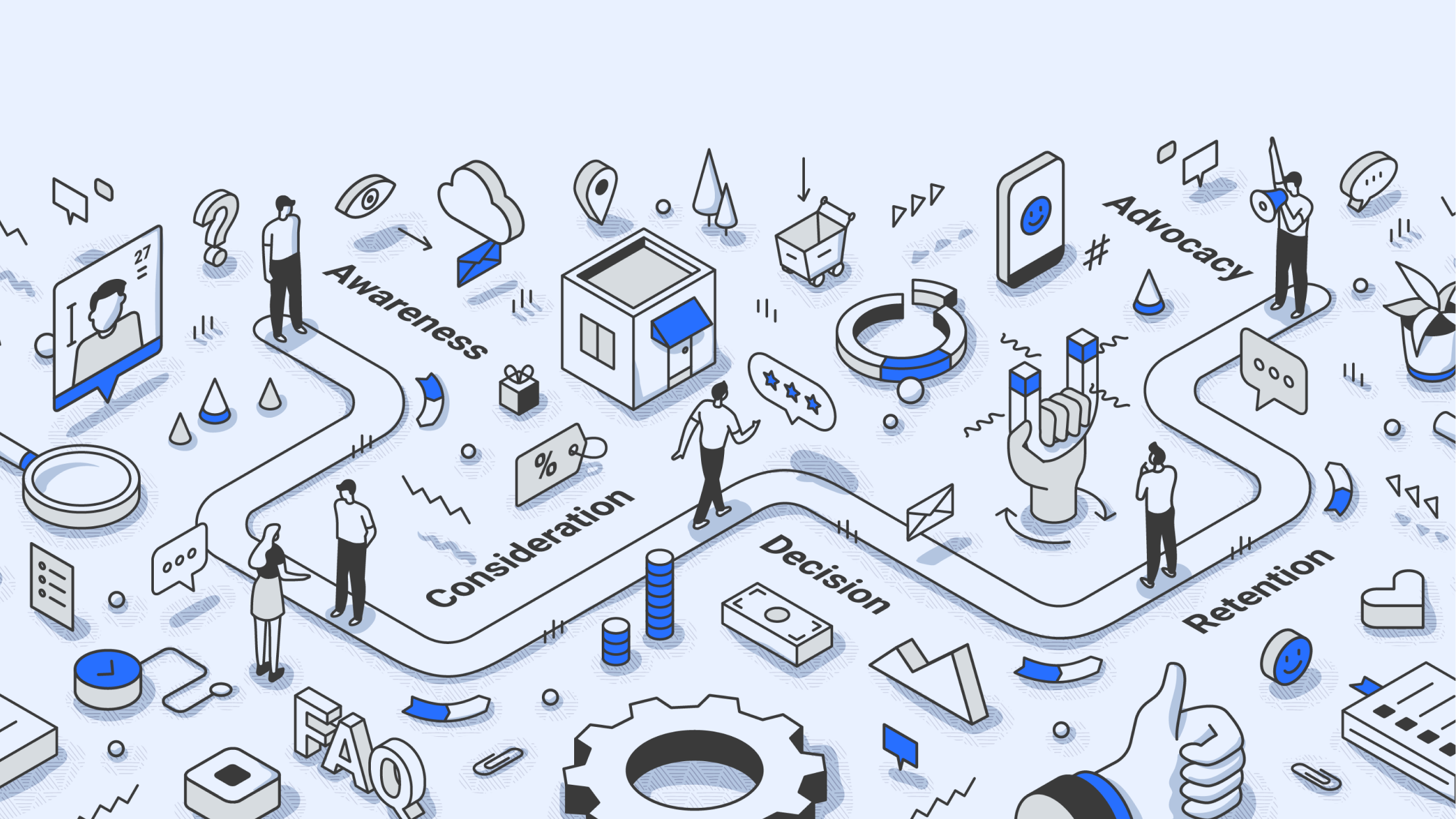
Standard stages across most industries: awareness, consideration, purchase, onboarding, retention, advocacy. For your map, identify which stages have the highest drop-off, the most friction, or the most unresolved negative sentiment.
Some brands discover their onboarding stage is actually the weakest link – customers arrive, get confused, and leave before ever reaching the retention stage. Others find the advocacy stage is where they’re losing the most ground, because customers with positive experiences aren’t being prompted or supported to share them.
4. Emotional states and pain points
This is the component most CX maps handle poorly. Emotional states at each stage should come from real customer language: the words customers actually use in reviews, social posts, and support transcripts – not the words your internal team uses to describe what customers feel.
There’s a meaningful difference between “customers are unhappy with support” (an internal opinion) and “customers describe feeling dismissed when tickets are closed without a resolution note – sentiment data shows a drop in positive social mentions after every support interaction on Twitter” (an observable pattern from actual data).
The first version generates a vague to-do item. The second generates a specific fix.
5. Feedback and conversation data
A CX map needs two types of data: structured (CSAT scores, NPS, survey responses) and unstructured (social mentions, reviews, support tickets, call transcripts).
Structured data tells you the what – scores going down, resolution times going up. Unstructured data tells you the why – the language customers use, the themes that keep appearing, the frustration that sits underneath the numbers.
Both together give you a map worth acting on. One without the other leaves the picture incomplete.
How to Build a Customer Experience Map: Step by Step
Follow this step-by-step framework to create a customer experience map that highlights real pain points and actionable opportunities.
Step 1: Gather data before you draw anything
Don’t open a whiteboard until you have real data in front of you. A CX map drawn from an opinion in a conference room is theater, not strategy.
Pull CSAT, NPS, and support ticket data. Run social listening across the channels where your customers actually talk – social media, review platforms, forums, news. Interview your customer-facing teams: support agents, sales reps, account managers. They know things that don’t show up in dashboards.
Step 2: Define personas from your actual customer base
Segment by behavior and interaction pattern, not demographics. Look at how different customer segments contact you, what they complain about, how they escalate, and what they say publicly when things go wrong.
Two or three personas to start. Revisit them after six months once you have more data.
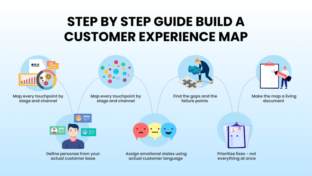
Step 3: Map every touchpoint by stage and channel
List every place a customer interacts with your brand: website, app, email, calls, social, reviews, in-store, chatbot. For each touchpoint, record the channel, the team responsible, and whether you currently have data on what happens there.
That last question is important. If you don’t have data on a touchpoint, you can’t assess it. That absence is itself worth noting on the map.
Step 4: Assign emotional states using actual customer language
Go back to your unstructured data – social posts, review verbatims, support transcripts. Find the language customers actually use at each stage. Map it to each touchpoint. Identify the two or three stages where negative emotion is most concentrated.
This is the part where most CX mapping exercises fall apart. The emotional layer gets filled in from internal assumptions rather than customer language. When it does, the map stops being diagnostic and becomes decorative.
Step 5: Find the gaps and the failure points
Where do customers go silent? Where does CSAT drop sharply? Where do escalations spike? Cross-reference social sentiment with support ticket volume to find the points where both are moving in the wrong direction at the same time. Those compound failure points are usually where the biggest problems live.
Step 6: Prioritise fixes – not everything at once
Score the gaps you’ve found by two variables: how many customers are affected, and how hard the fix is. Rank them. Pick the three highest-impact gaps to address in the next quarter.
A CX map that generates 40 action items will be ignored by everyone it’s shared with. One that generates three clearly scoped priorities, with owners attached, will actually get used.
Step 7: Make the map a living document
A CX map that never gets updated is worse than no map at all. It gives teams a false sense of confidence in a picture that’s already outdated.
Set a quarterly review cadence at minimum. Feed in new social listening data, updated survey scores, and ticket volume trends with each update. Assign clear ownership: someone responsible for monitoring and updating each stage of the map.
How Konnect Insights Supports the CX Mapping Process
The most common failure point in CX mapping isn’t the methodology. It’s the data. Teams end up stitching together inputs from five or six separate tools – a social listening tool, a support platform, a survey tool, a CRM, a reporting dashboard – and by the time they have everything assembled, half of it is out of date.
Konnect Insights brings those inputs into one place.
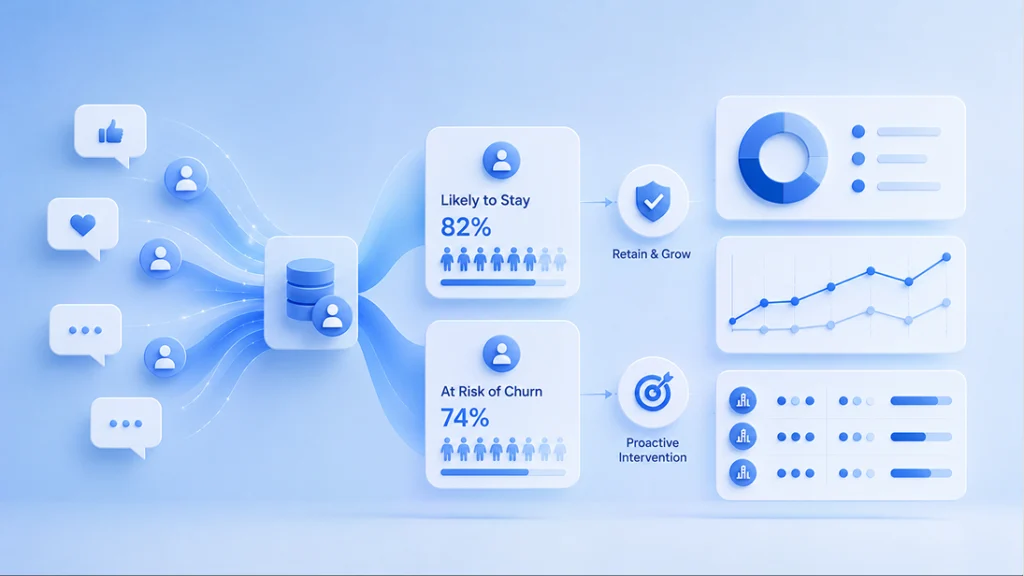
The social listening modules pull in unsolicited customer feedback from 20+ channels, including social platforms, forums, review sites, and news sources. That gives you real emotional and behavioral data for each stage of the map, not just what customers say when prompted.
Unified customer profiles in the Social CRM consolidate interaction history across channels, so each persona is built on actual behavior patterns, not assumptions. Sentiment analysis and conversation categorisation through Konnect AI+ identify emotional state clusters and pain point themes at scale – which is relevant when you’re mapping thousands of interactions, not twenty.
Konnect BI dashboards track CSAT, ticket volume, sentiment, and resolution times by channel. That’s the quantitative layer your map needs to sit alongside the qualitative picture.
For teams using Microsoft Dynamics 365, Konnect’s native integration means CRM data and social interaction data are already in the same view.
The value isn’t just data collection. It’s having all the inputs a CX map needs – conversation data, sentiment, ticket history, survey scores – in one place rather than assembled from multiple disconnected sources.
Conclusion
Brands that do customer experience mapping properly tend to find the same thing: the biggest problems are not where the team expected them to be.
The gaps live in the handoffs between channels. In the moments no one clearly owns. In the interactions that get logged somewhere but never analysed. A customer who contacts you three times about the same problem without getting a connected response is not a data point in one team’s dashboard – they’re a failure across the entire system.
A well-built CX map makes those failures visible. Not as abstract scores, but as specific moments where the experience broke down and what it cost.
The brands that act on it – that assign owners, set quarterly reviews, and update the map with real data rather than letting it collect dust – are the ones that catch problems before they become churn.
The map is the start. What you do with it is the work.
Frequently Asked Questions
Author